Yeti’s wordmark is its best brand asset. It just got rid of it in a new ad
Culture Index
Score Breakdown
Relevance
10/25
Freshness
8/25
Authority
25/20
Brand Signal
6/15
Depth
6/15
5-Axis Cultural Radar
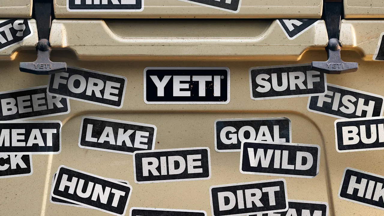
Yeti’s logo is simple: just its name written in an all-caps sans-serif font, placed within a rounded rectangle. But to speak to new consumers, they’re getting rid of the one element that gives it brand recognition. In a new campaign created in collaboration with Wieden+Kennedy Portland, Yeti deleted the “Yeti” in its logo to make room for other four-letter words, like “Hike,” “Surf,” Golf,” “Fish,


