The ‘Saturday Night Live UK’ logo is just British enough
Culture Index
Score Breakdown
Relevance
15/25
Freshness
8/25
Authority
25/20
Brand Signal
9/15
Depth
6/15
5-Axis Cultural Radar
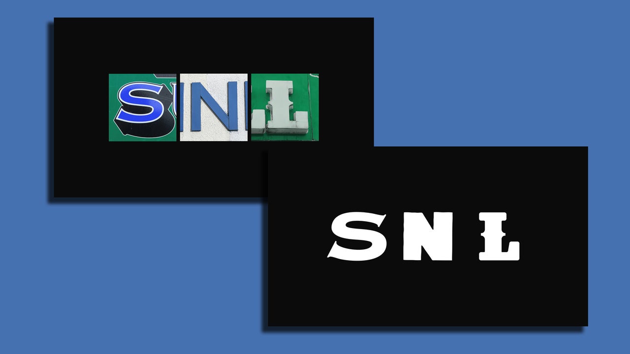
When Saturday Night Live launched in the U.K. earlier this year, the show wanted a logo that looked distinctly British. To design it, the creative agency Stink Studios looked to the streets of London for inspiration. The SNL UK mark is dynamic, and made from hundreds of photos of the letters S , N , and L that members of the Stink Studios team took of British signs in London and beyond. Letters we
.jpg)